NEW PRINT

There has been a lot of studio work though this blog doesn’t show it. No major excuses but there was a lot of getting used to being home, enjoying the holidays, catching my holiday cold and getting back into a studio routine.

The upcoming items that will be shown here will be: more map drawings, more prints and a collection of four Imaginary Vases. Each of these categories have continued to develop in good directions. I will talk about all of these pieces individually when i get good images of them. In the meantime here is one print:

This print continues the “Still Life” theme. The wide dimension has become a difficult and challenging format. I continue to use similar elements in the prints. I have a lot of Prints “in progress” and leave them on the wall to study, sometimes addi…

This print continues the “Still Life” theme. The wide dimension has become a difficult and challenging format. I continue to use similar elements in the prints. I have a lot of Prints “in progress” and leave them on the wall to study, sometimes adding additional colors and lines to the prints after studying them for a while before officially saying that they are completed. This particular print didn’t seem to require a lot of additional touch ups and came out successfully after two or three passes.

PRINTS

This should be the last entry for the prints I made at Chateau Orquevaux. I have been organizing my activities into categories and I think the process has been helpful for me to understand the amount and type of work that I made during my residency.

Organizing as well as writing and thinking about this body of work makes me realize that the residency was a success and that, when I begin to make new work, there is a healthy and productive path of thinking, process and possibilities to pursue.

I don’t intend to duplicate any work that has been documented already, but I could make a mistake. These are the remainder of the prints from the residency

“Big Yellow” 21” x 18”

“Big Yellow” 21” x 18”

Cubist Still Life 21” x 18”

Cubist Still Life 21” x 18”

Orange Still Life 21” x 18” kind of simple. An example of whether another pass is merited or not

Orange Still Life 21” x 18” kind of simple. An example of whether another pass is merited or not

Pink and Blue Still Life 1 20” x 16”

Pink and Blue Still Life 1 20” x 16”

Pink Still Life 21” x 18”

Pink Still Life 21” x 18”

Steel Grey Still Life 20” x 18”, a variation of Pink still life shown above.The two prints shown above are “Red and Black" Still Life” , and “Retro Still Life” @ 20” x 16”

Steel Grey Still Life 20” x 18”, a variation of Pink still life shown above.

The two prints shown above are “Red and Black" Still Life” , and “Retro Still Life” @ 20” x 16”

MORE PRINTS

I originally was going to write about work that was not Black and white and thought that a more interesting approach was to talk about works that were “different” from a particular formula I developed in making the Orquevaux prints. Each of these prints is related to all of the work I made at Orquevaux in technique, theme etc. but the ones in this posting point to new and interesting directions that have potentials and possibilities that i could not predict.

This particular print, “Black and Blue Still Life” began with an “ordinary black and white trace print in the background. I placed (not certain why) a stencil that had wet ink on it from having been used on another print. The blue color is very cons…

This particular print, “Black and Blue Still Life” began with an “ordinary black and white trace print in the background. I placed (not certain why) a stencil that had wet ink on it from having been used on another print. The blue color is very consistent and solid but transparent. It also is a block of color that is the negative space of the black and white print. This seems to establish a relationship but not an immediately perceived one that creates a lot of interesting spatial effect.

I have made prints like this before in which something is obliterated and becomes a background for another image. This may have been made in three or four passes. The first could have been the original print that was obliterated in a second pass or …

I have made prints like this before in which something is obliterated and becomes a background for another image. This may have been made in three or four passes. The first could have been the original print that was obliterated in a second pass or else a lighter colored grey was printed on the darker color then highlighted with the last pass, a sight black outline. This print is very subtle but the images are exuberant.

This print underwent a lot of passes as well as supplemental additions with paint to get the final results. It is called “Night Life Still Life”. I think it has a little bit of a Paul Klee atmosphere. It would be difficult to analyze the process and…

This print underwent a lot of passes as well as supplemental additions with paint to get the final results. It is called “Night Life Still Life”. I think it has a little bit of a Paul Klee atmosphere. It would be difficult to analyze the process and steps of this piece. It all happened over many days with little and big decisions made - something like a stew simmering with an occasional spice added during the process.

There are many possibilities in this print. I used stencils that “blocked” paint from being applied to another print, then applied them to the surface of this print. The stencils were very messy with evenly applied ink, they also curled and were use…

There are many possibilities in this print. I used stencils that “blocked” paint from being applied to another print, then applied them to the surface of this print. The stencils were very messy with evenly applied ink, they also curled and were useless except for this one time only use. Everything is a little ghostly and undetermined. The stark silhouette is painted in and the bust has a trace print orange outline. It relates nicely to other prints in the series but stands alone for technique and overall effect.

This is the most undefined of the still life series. It is called “Still Life Shadows” One can imagine shadows on a wall from a still life filtered through a transparent curtain to create this effect. If the viewer is familiar with my “vases” or not…

This is the most undefined of the still life series. It is called “Still Life Shadows” One can imagine shadows on a wall from a still life filtered through a transparent curtain to create this effect. If the viewer is familiar with my “vases” or not, the image is clearly one of vases and flowers as well as time, motion and memory.

“Subtle Still Life” is just what it says. it was made when I was becoming more specific with many of my still life prints. This was made with a “leftover ink” plate and an additional pass with red ink. None of the colors is very specific and I almos…

“Subtle Still Life” is just what it says. it was made when I was becoming more specific with many of my still life prints. This was made with a “leftover ink” plate and an additional pass with red ink. None of the colors is very specific and I almost decided to make one more pass, a more intensive color to define everything more but decided (on good advice) to not overwork pieces and let certain prints represent a point of time and technical development. This print didn’t have to be more specific, it could just be subtle.

This print does not have anything innovative at first glance other than having a painted background rather than using an elaborate stenciled background color. This was quicker to make and has an effect that is very different from the stenciled backg…

This print does not have anything innovative at first glance other than having a painted background rather than using an elaborate stenciled background color. This was quicker to make and has an effect that is very different from the stenciled background.

It is important to know when to use certain techniques and when to use others.

This entire set of prints, this body of work, definitely gave me a lot to think about.

MORE WORK FROM ORQUEVAUX

Included in this entry are some of the prints I made at the Chateau Orquevaux. Because I didn’t want to “dump” a lot of images all at once, I am showing the black and white images in today’s post and will post the more colorful and complicated prints tomorrow.

I made some work immediately upon arriving at Orquevaux but I wasn’t entirely happy with the results. I think that this was because I immediately started to make work without having thought about my surroundings, the ambiance of the studio as well as the rhythm and process of making new work. After a week, I began to incorporate the theme of “Still Life “into my work. I didn’t do this consciously but it came about as I became accustomed to my surroundings and studio. Every day I saw a bust of Henry IV, taxidermy heads, elaborate furniture, candelabras and statues of Napoleon comfortable placed next to each other. It became very easy to include an “imaginary vase” along with these elements in my still life prints.

I am including the black and white or monochrome images in today’s post and will show the more colorful pieces later. The black and whites introduce the still life theme first but some of the black and white or monochrome pieces were made along with the colorful prints.

The sizes are typical but are a little smaller than usual. This happened because I had to cut down some of the paper for the convenience of travel and some of the pieces of paper, when cut from larger sheets became odd sizes. These new sizes made me think about space differently and perhaps allowed some other types of spatial/compositional relationships and designs in the prints. The largest width is 21” the smallest height is 15”.

The backgrounds became very important in these prints. I enjoyed varying the scale of the cross hatched areas in the background and foreground, creating contradictory but also rich spatial areas. Some of these backgrounds were very tedious to make. That could have accounted for my varying the grid as I made my way across the picture plain. The “pentimento” of older prints, still left on the plate, added to the richness of the surface. I think that this group of prints does show a steady progression of purposeful discovery and exploration. As planned as many of these prints are, I still can become surprised by the unintentional results. One of the backgrounds in these prints reminded me of George Herriman (of Krazy Kat fame)

PORTFOLIO

I’ve made two entries about Orquevaux and the studios. I was going to post a ton of prints today but I think I will spread out my postings so that different types of work will be able to be seen in a more selective presentation.

I made two suites of small drawings/prints, the “World Atlas” and the “Orquevaux Suite”. Each of them could be expanded or repeated.

The first suite is a series of ink drawings painted on maps found in a 1960s French World Atlas. There is a fine white line on each drawing made by a “sharpie”-like ball point pen.

I cut out all of the maps and made an individual drawing of an “Imaginary vase” on each sheet. All of the “French” maps have been completed (20 or so?). I still have the rest of the world’s maps to complete. I am unsure whether I should maintain the same format or else to use a different color of ink for them. I also would exhibit them as one “suite” of works, not as individual pieces.

The process of making these was very immediate. I do not recall any missteps or mistakes in making these. Each was spontaneously drawn on the map without prep work. The Maps are @ 10” x 6”.

I tried to be influenced by the space and design of each map. But, even though they all have good design and relate to the maps, I think that the successful relationships between figure and ground are happy accidents.

The “Imaginary Vase” above is one of ten trace prints that make up the “Orquevaux Suite.” I constantly am making images like this but this is the first time I have made a sustained effort to make a number of works that had the same format. (Perhaps …

The “Imaginary Vase” above is one of ten trace prints that make up the “Orquevaux Suite.” I constantly am making images like this but this is the first time I have made a sustained effort to make a number of works that had the same format. (Perhaps I was influenced by the “World Atlas” series shown above). In this suite the drawings are fairly simple but have backgrounds painted in with watercolors. Each background has a different pattern and a different color. These pieces are @ 9” x 6”.

This is another trace print from the Orquevaux Suite.

This is another trace print from the Orquevaux Suite.

STUDIOS

Francine and I shared a studio on the third floor of the Chateau for two weeks then, after she began to make larger works that needed additional space, she moved into a space in the Stables. At the halfway mark in our month’s stay, I took down all of my completed work and began to make some of the “still lives”.

The photos show the work in the studios as well as works in progress. Additional entries will feature individual works that we both made.

BACK HOME AGAIN

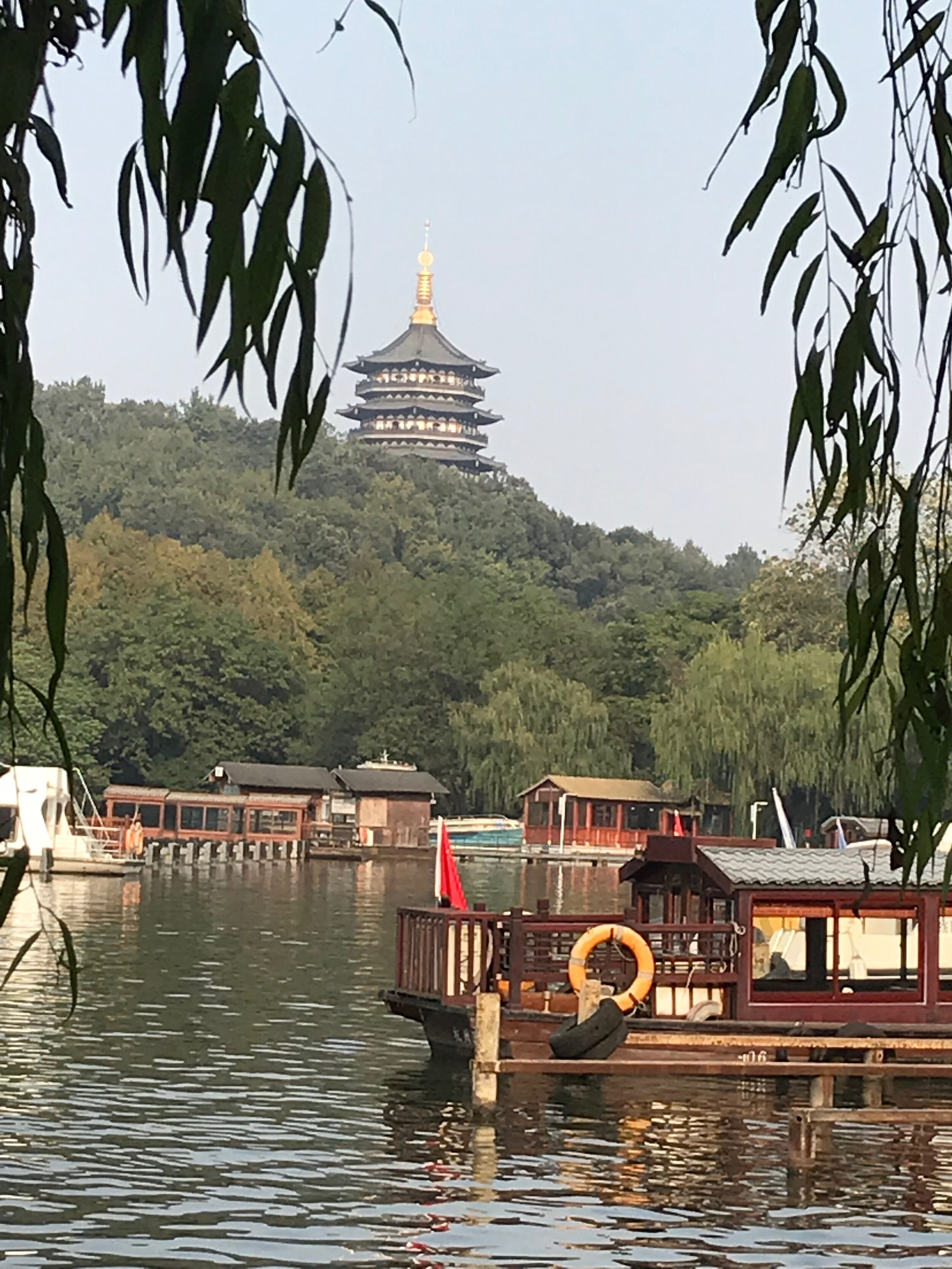
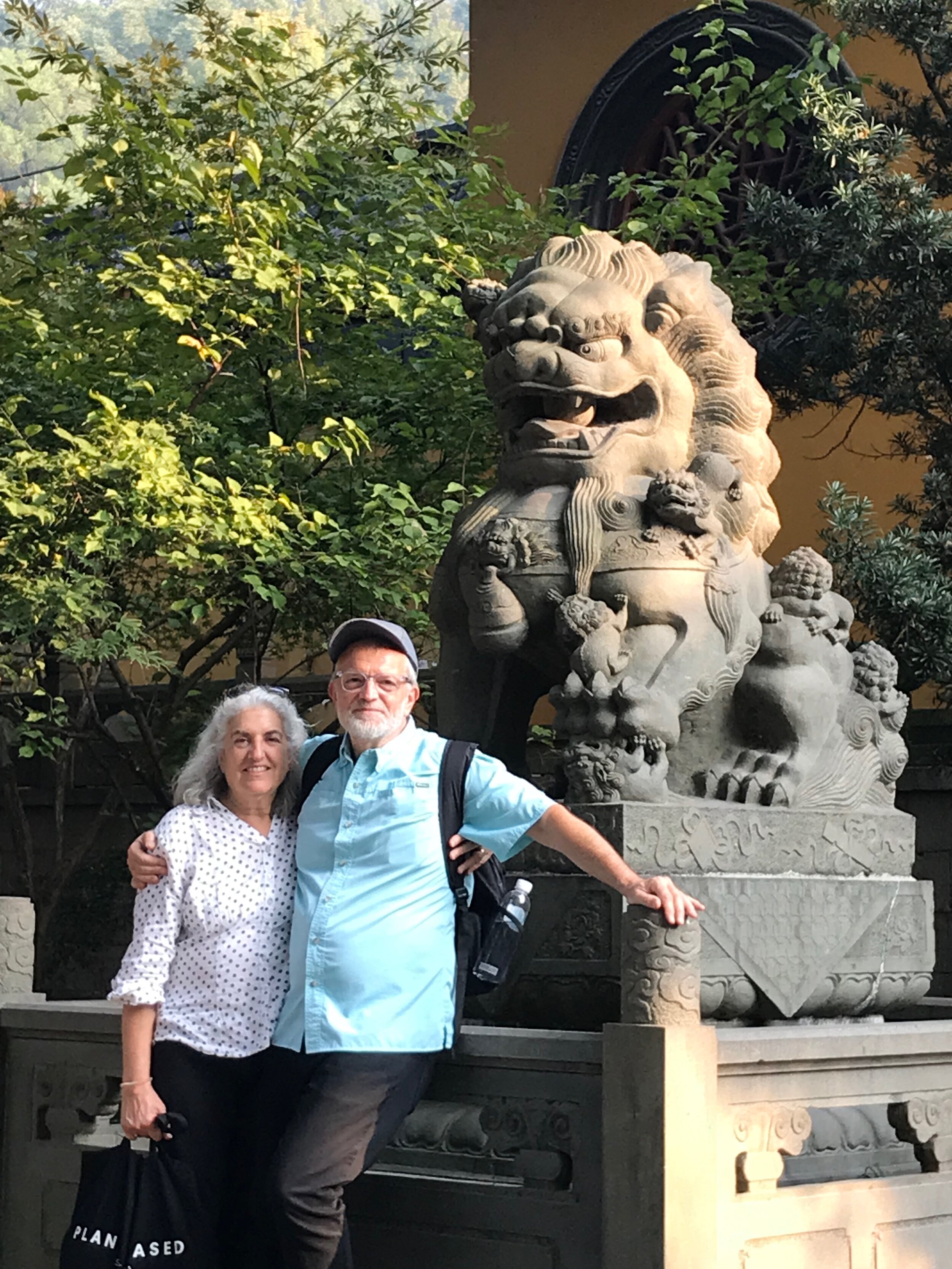
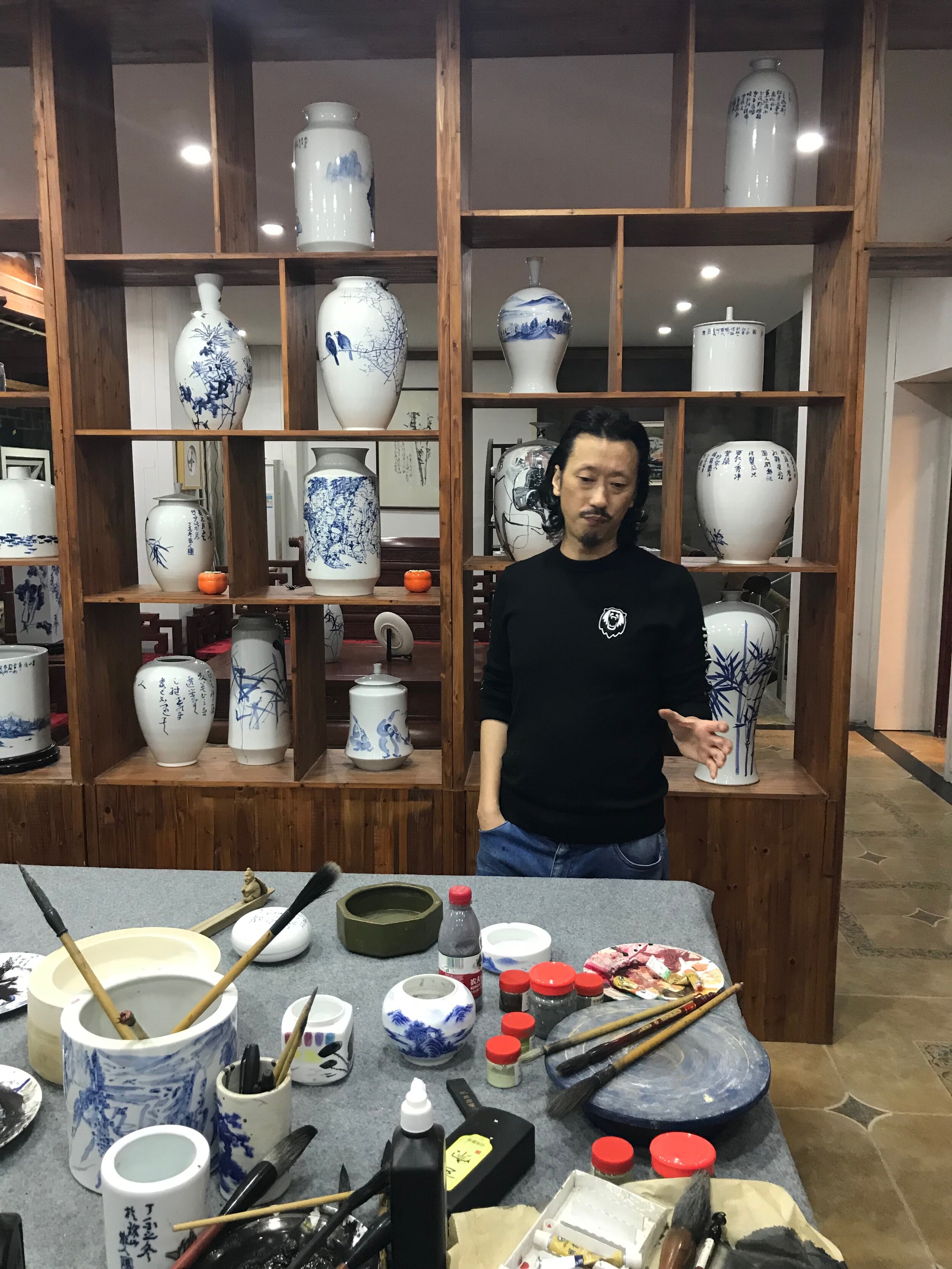
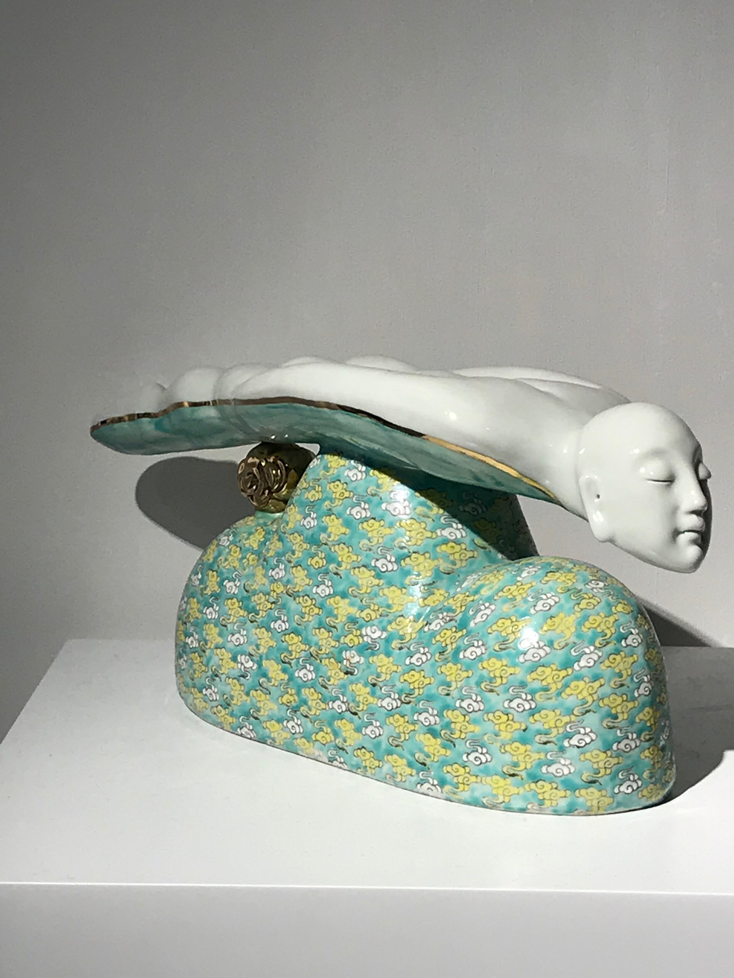
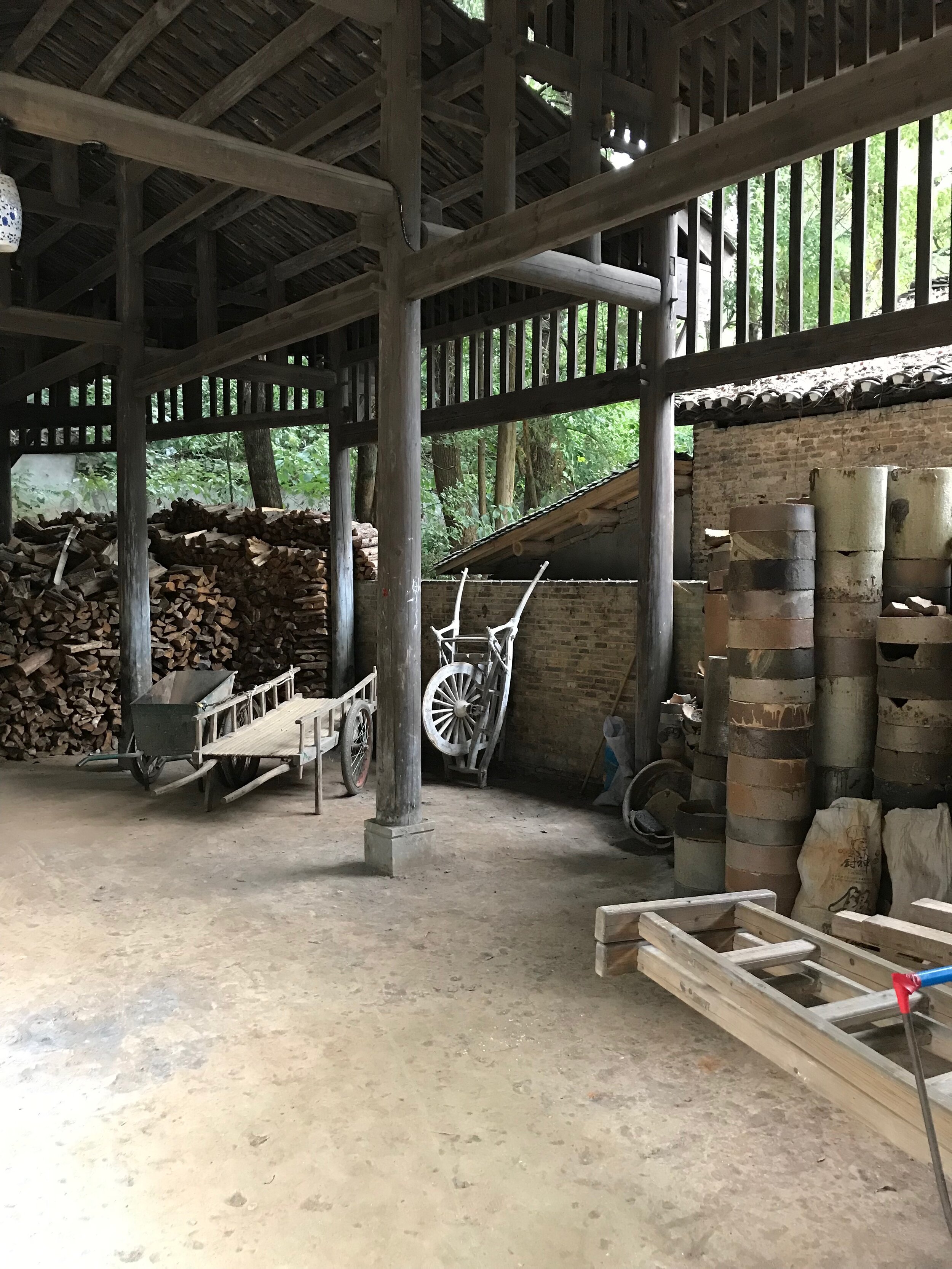
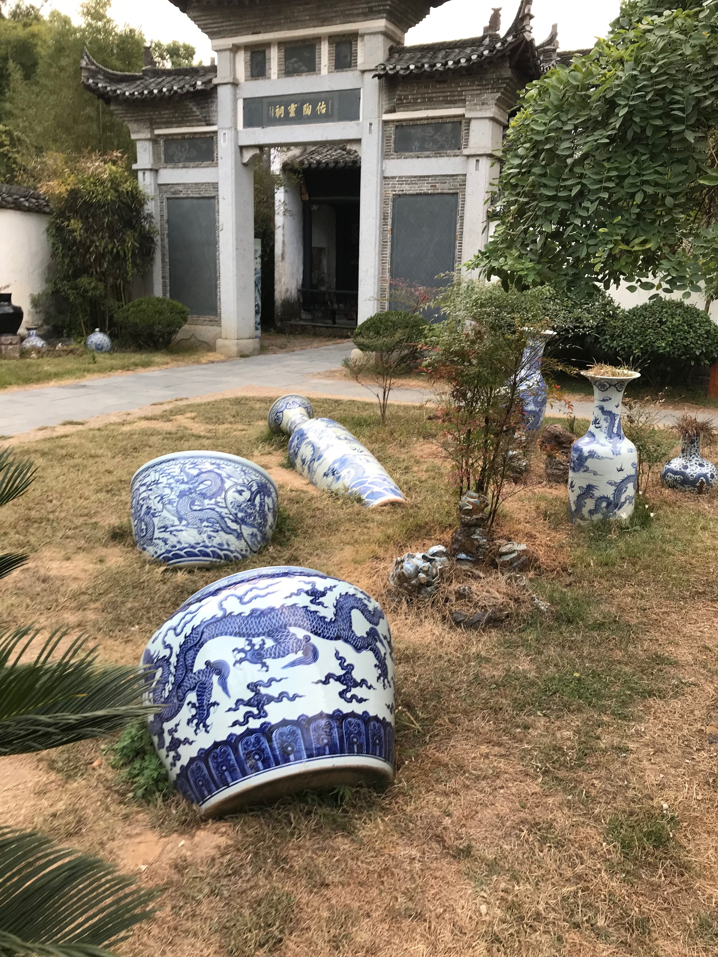
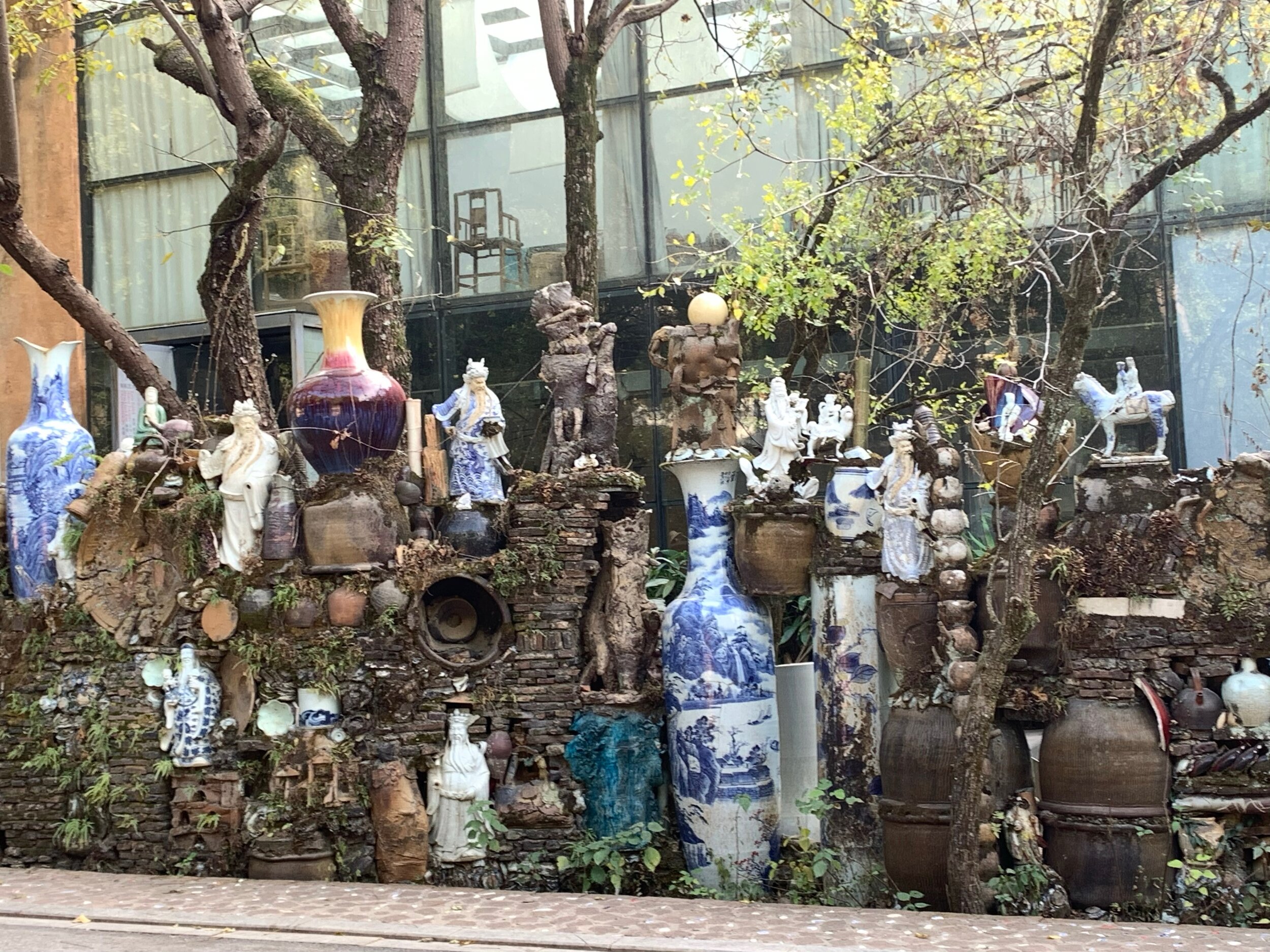
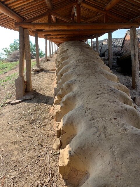
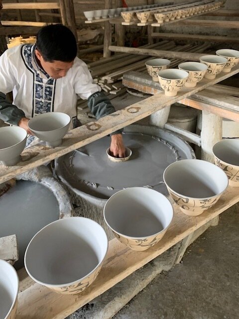
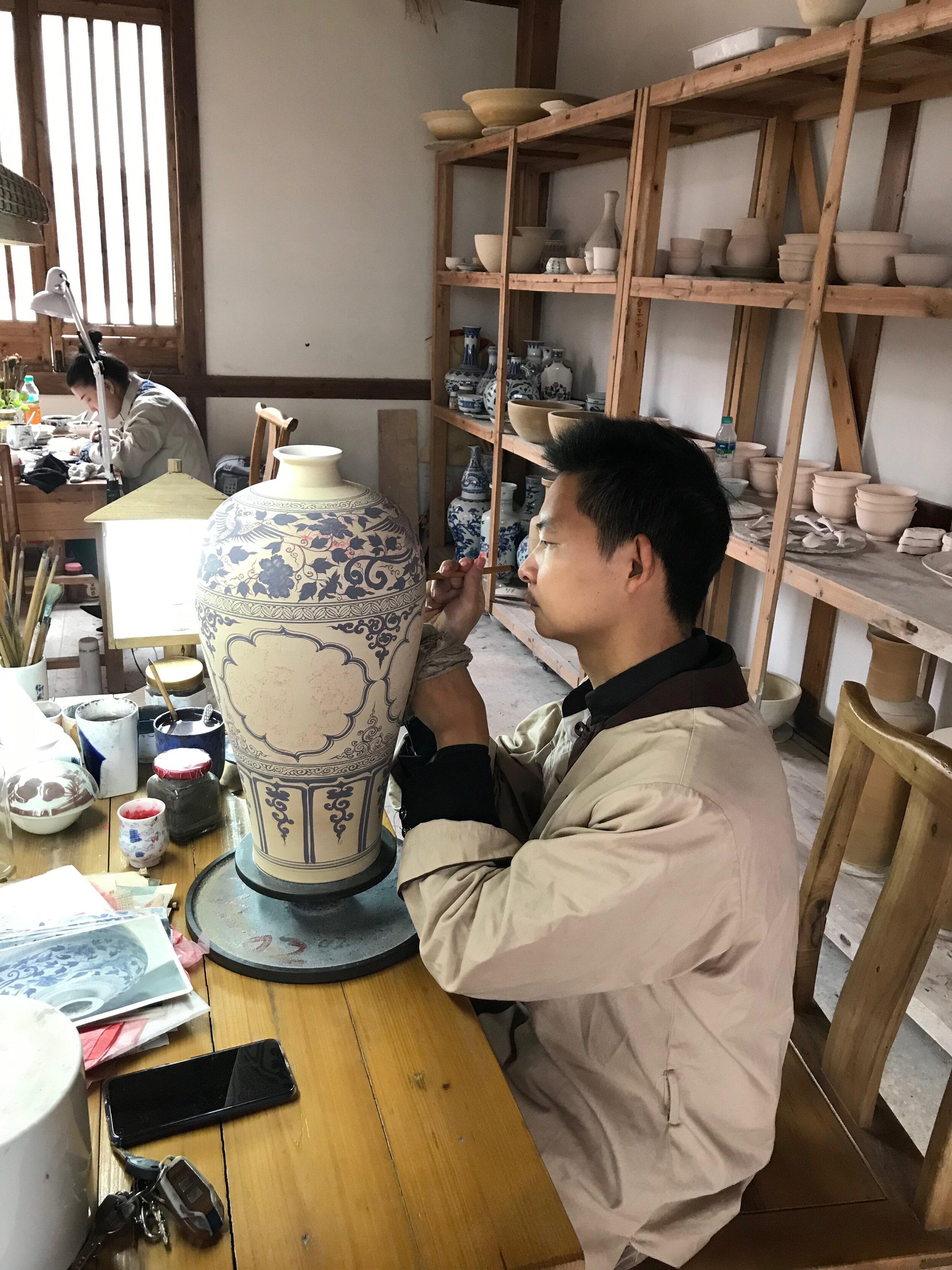
It has been some time since we entered any information about our activities. Despite the blankness of entries on our blog, we have been very productive and busy. My last entry was written just as we were about to leave for our residency after our China adventure.

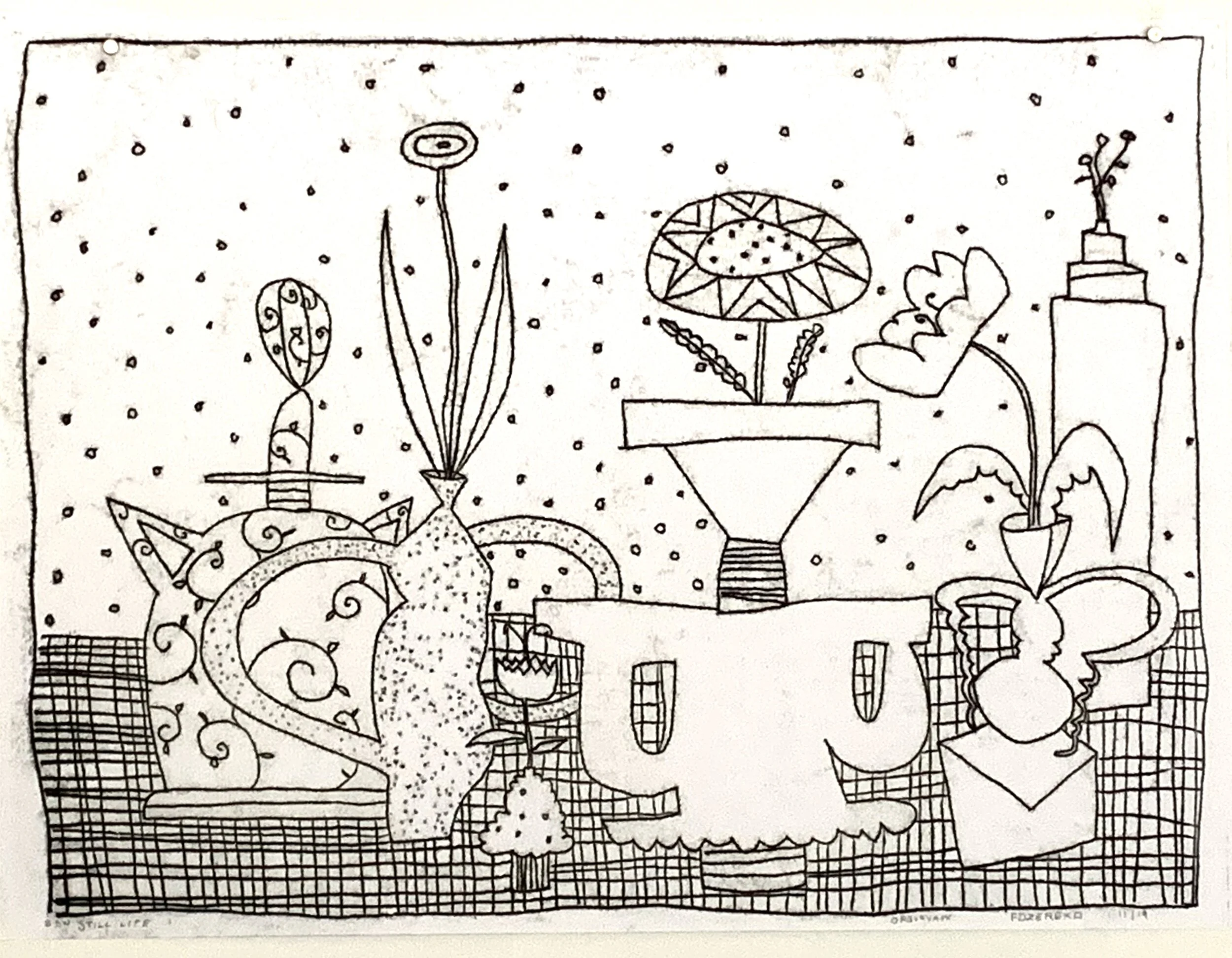
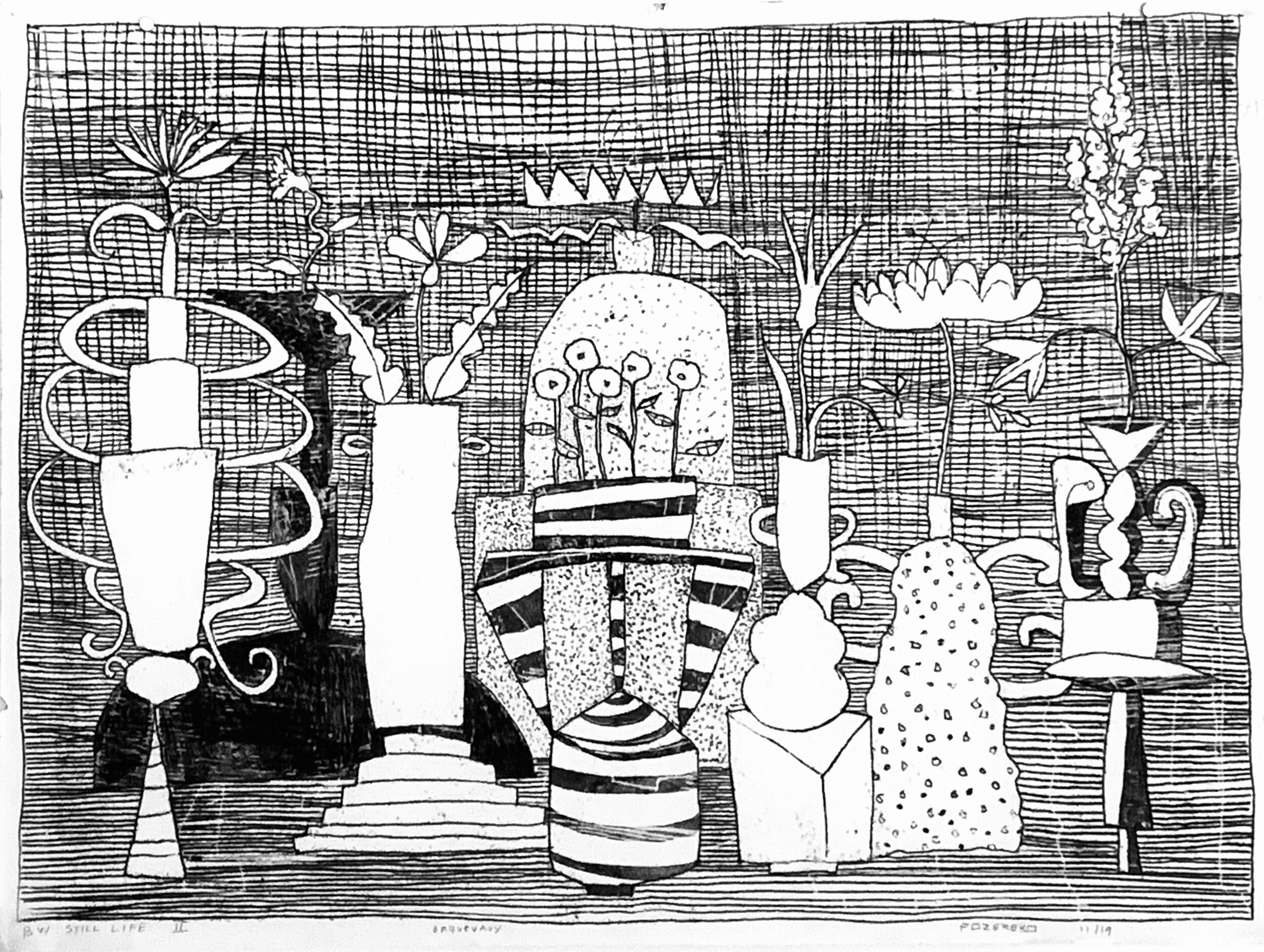
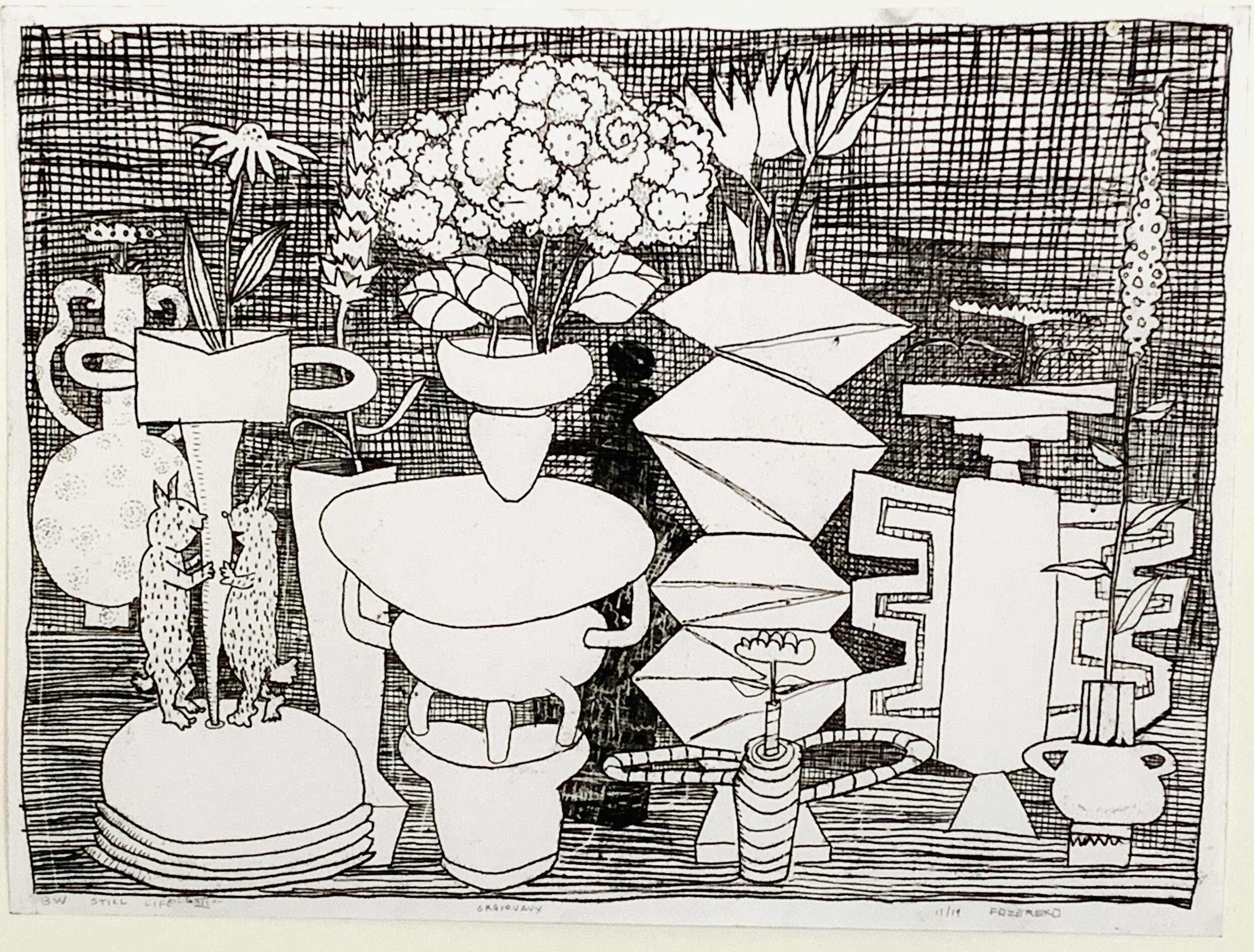
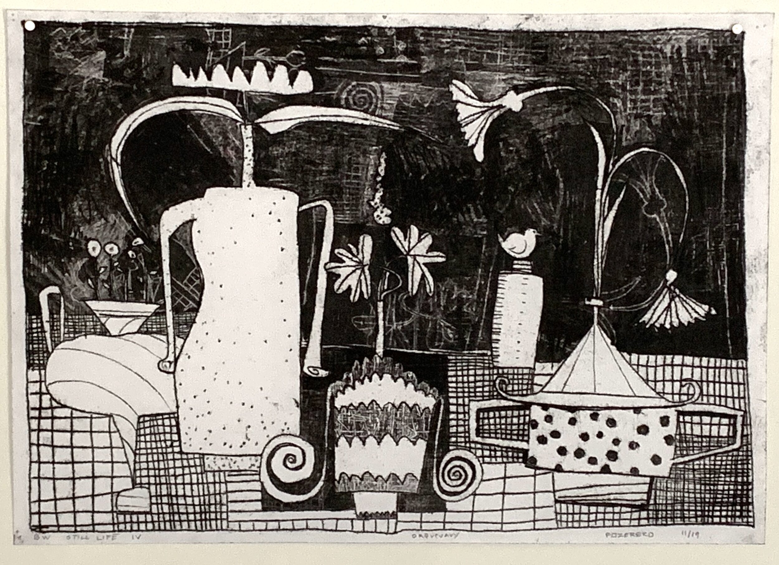
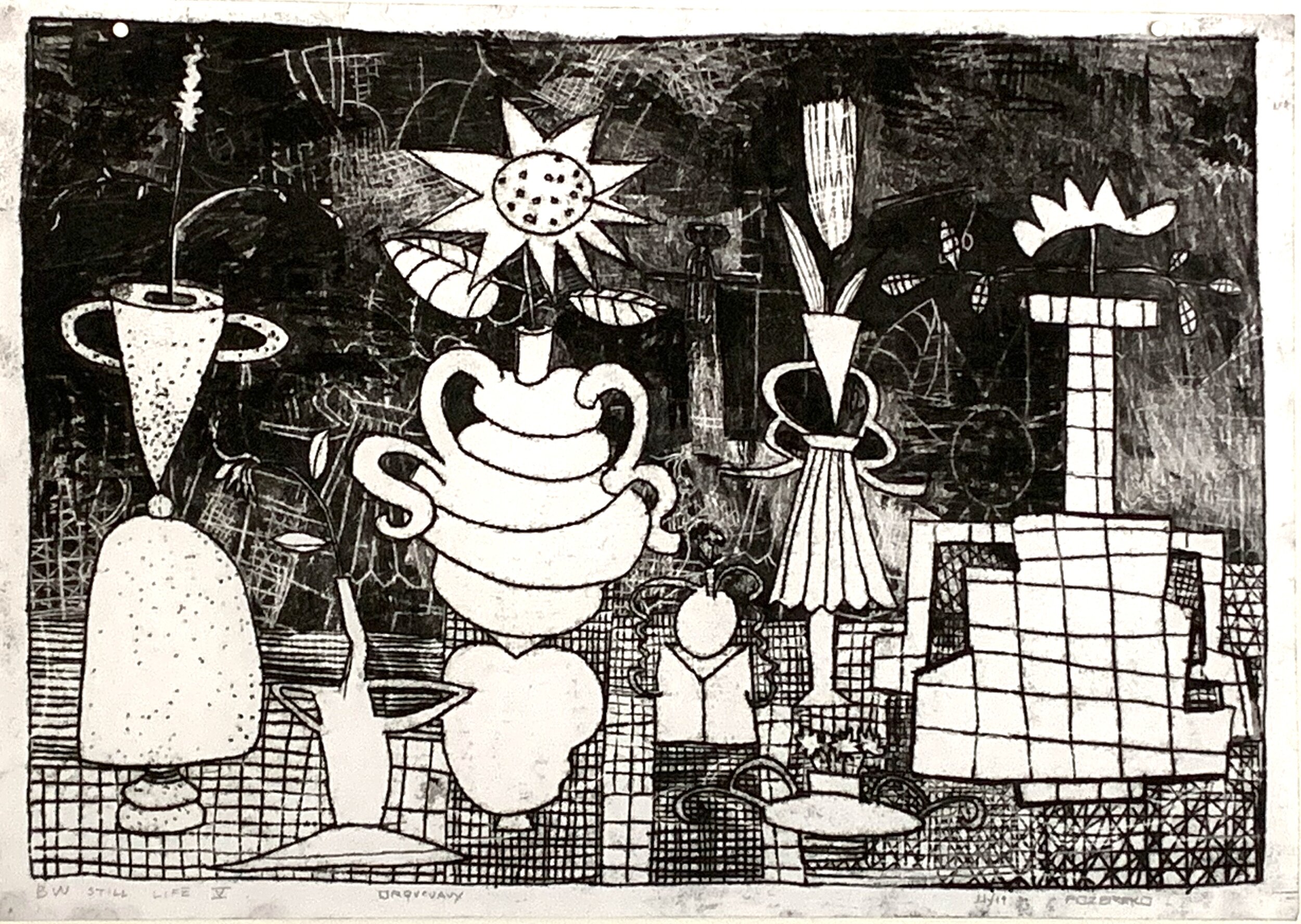
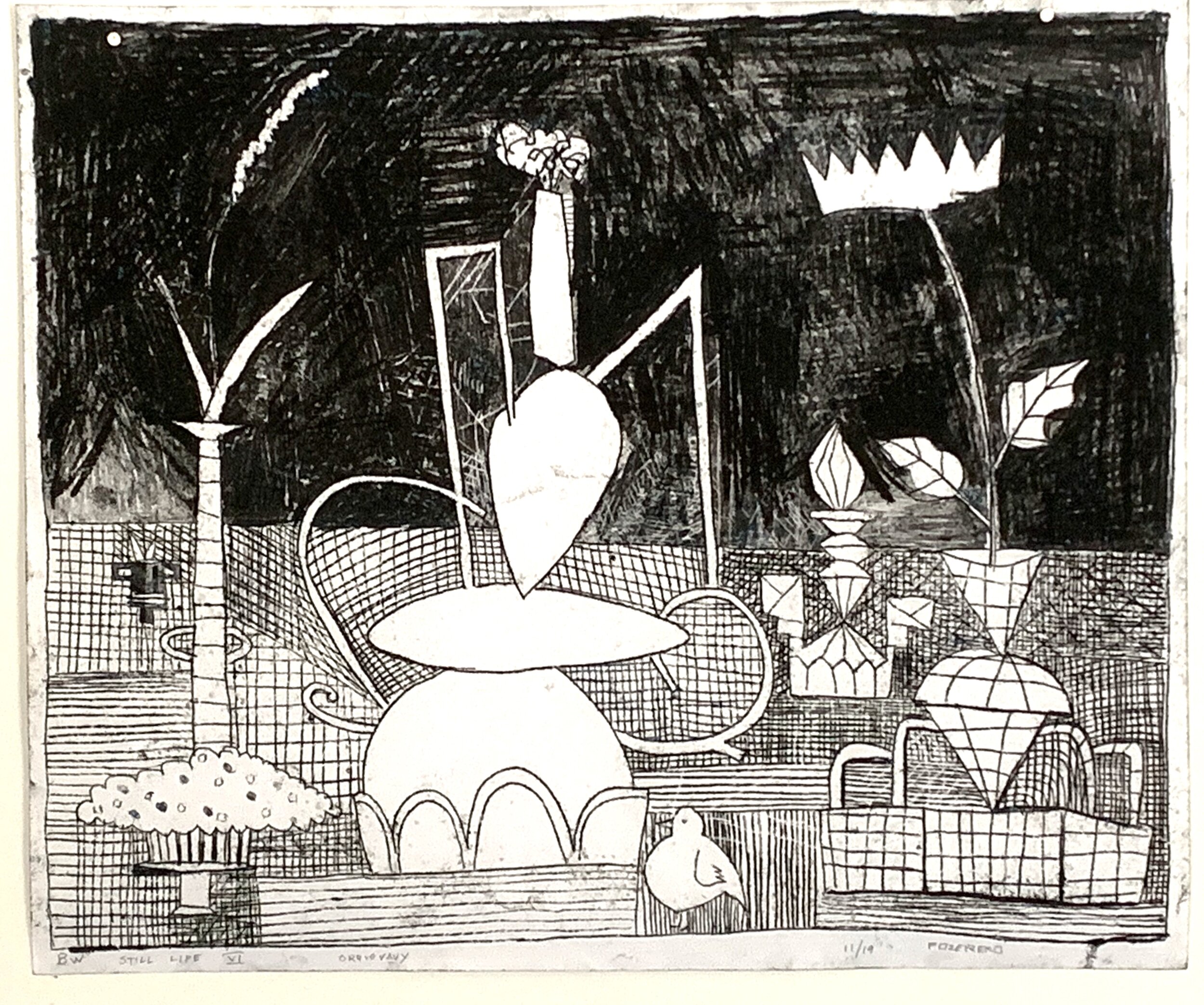
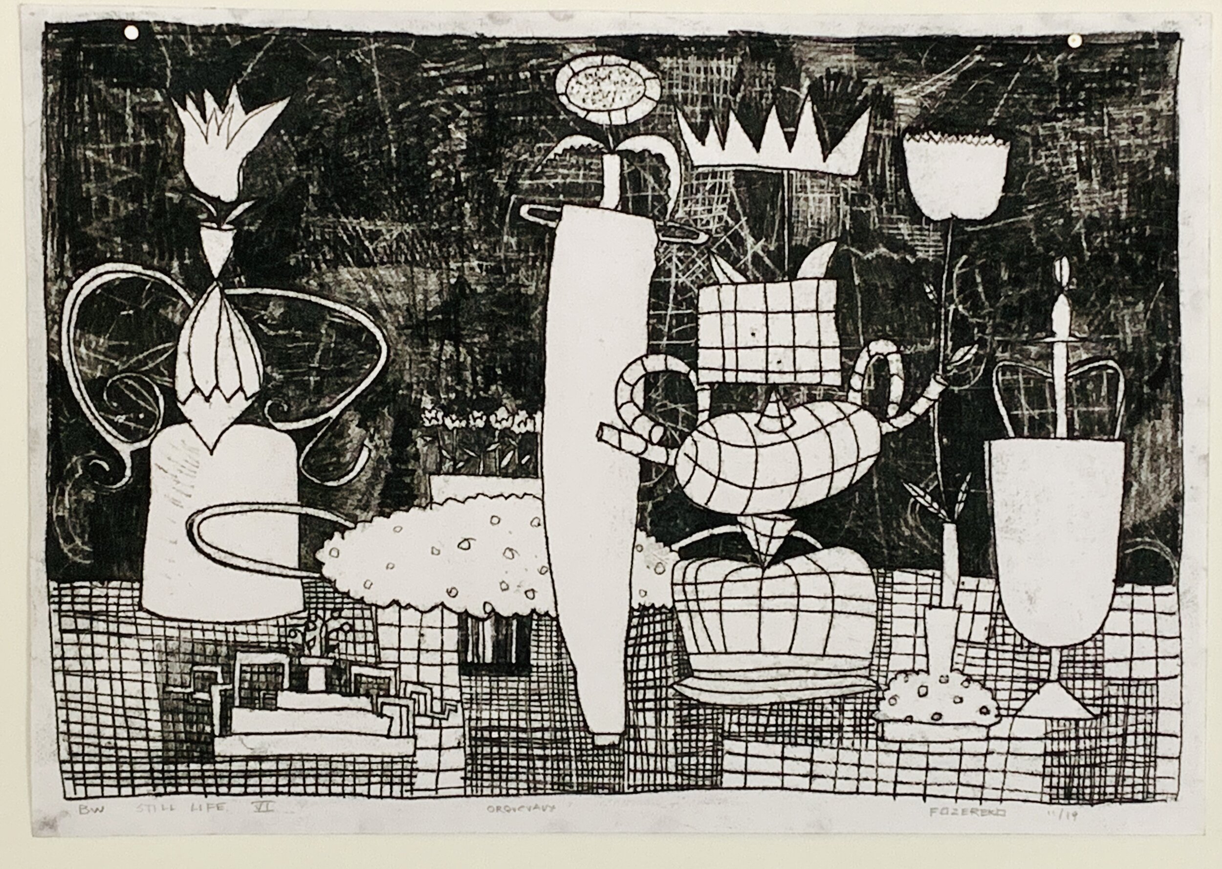
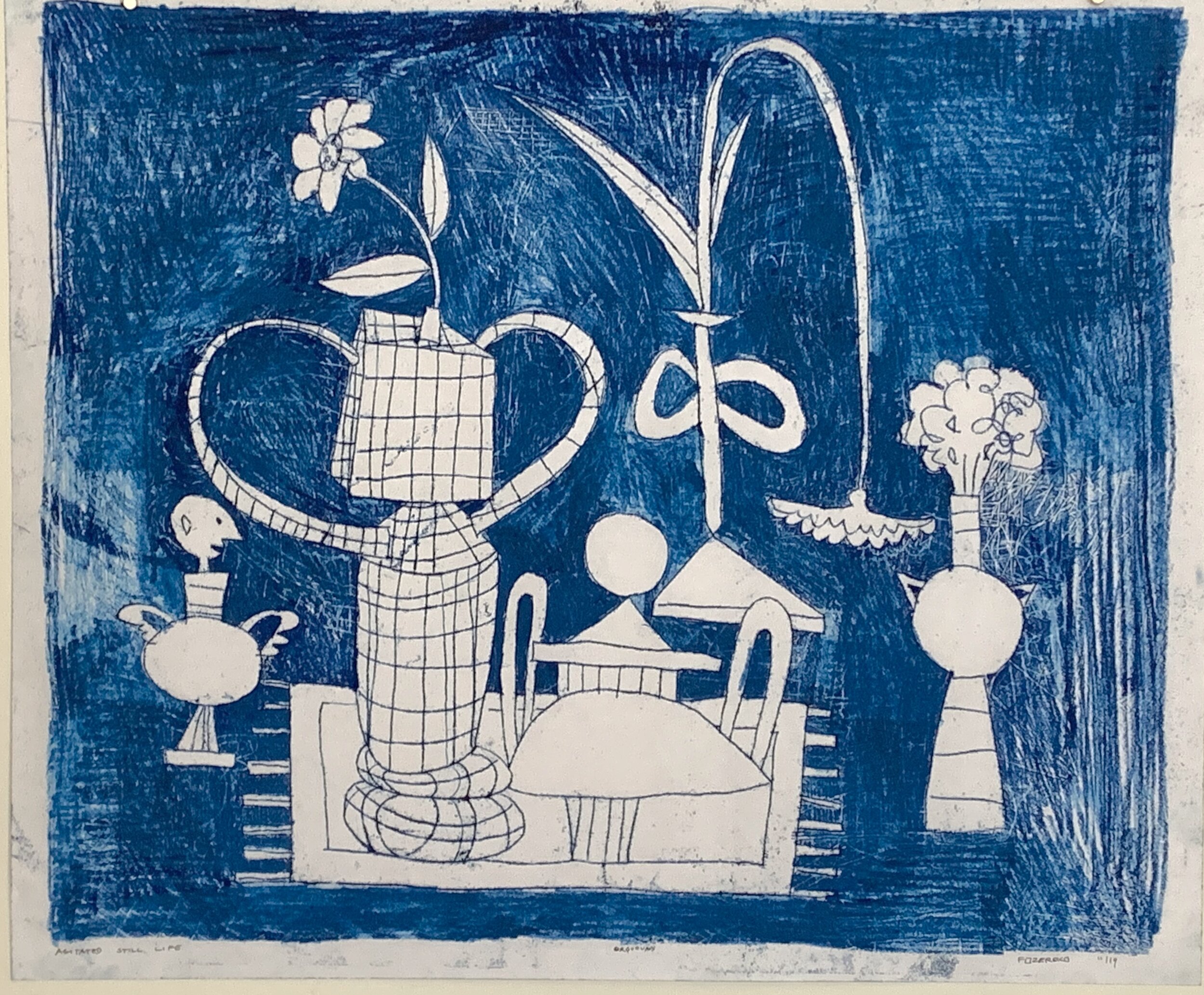
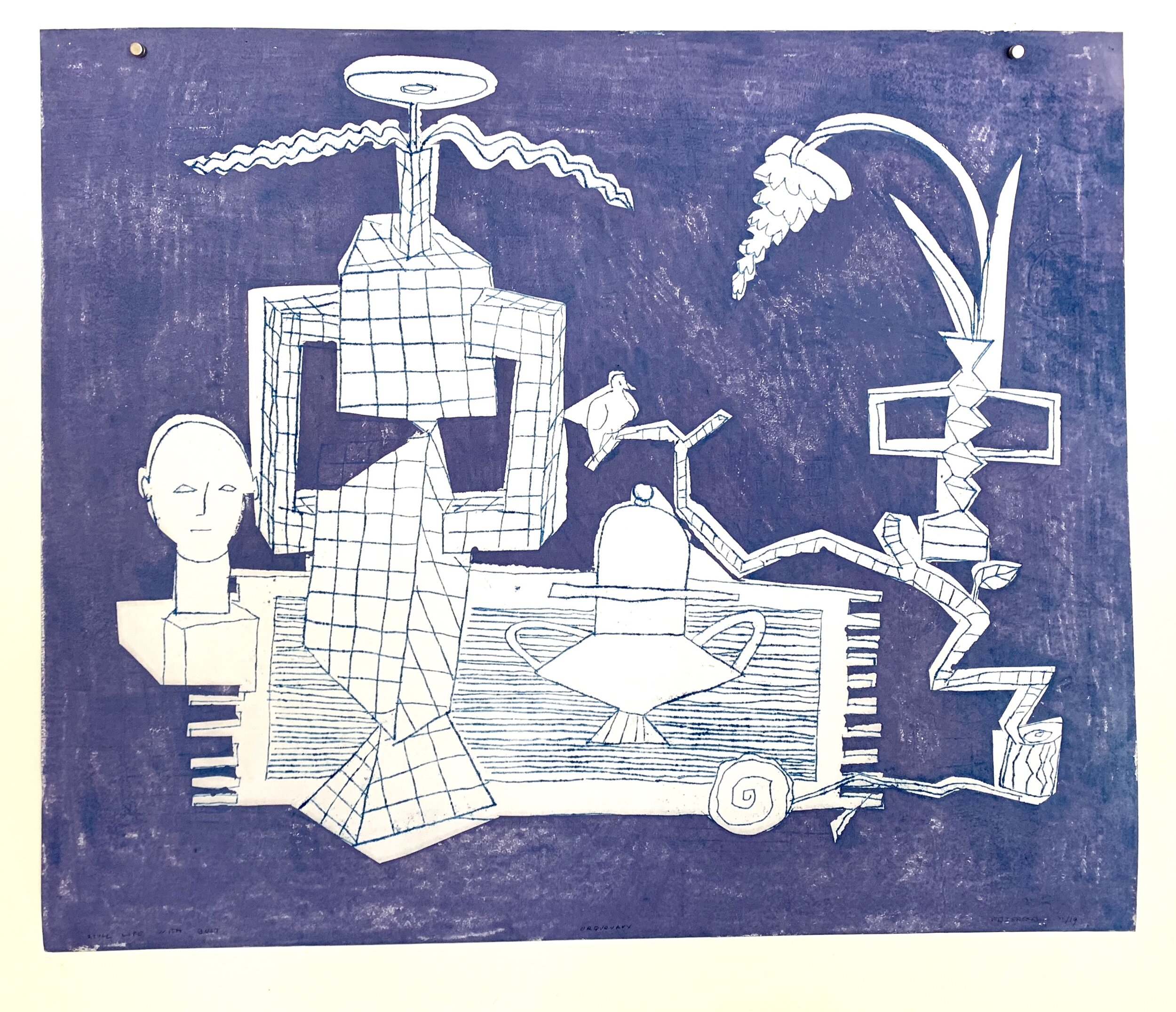
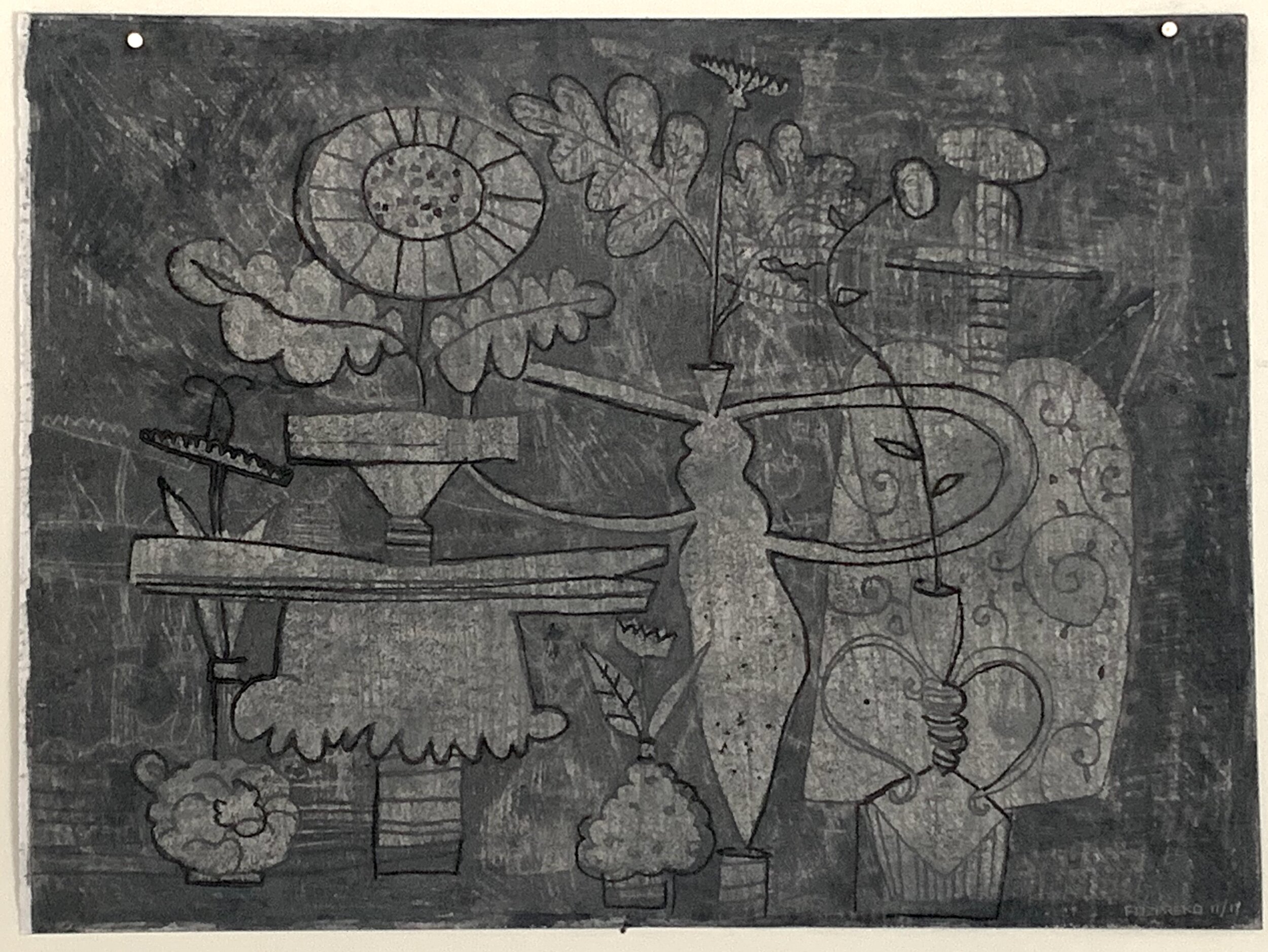
The next blog entries will try to summarize our art making, and travel experiences at the Chateau Orquevaux in France for the month of November. There is a lot to cover.

It is difficult to report on older events while simultaneously trying to catch up with all of the obligations we have avoided or missed while gone as well as to get ready for all types of coming events. But this is an attempt.

First of all, The Chateau Orquevaux:

The Chateau Orquevaux is located in the village of Orquevaux northeast /east of Paris. We took a two and a half hour train from Paris to Chaumont and were picked up at the station to begin our residency. Orquevaux is a very charming village located in a very beautiful but isolated part of France. There are other similar villages surrounding Orquevaux, but none of them has such a beautiful unity about it - its architecture, structure, surroundings are all of one piece, intact. There are no glaring modern intrusions in the village. The most significant item in the village is the Chateau.

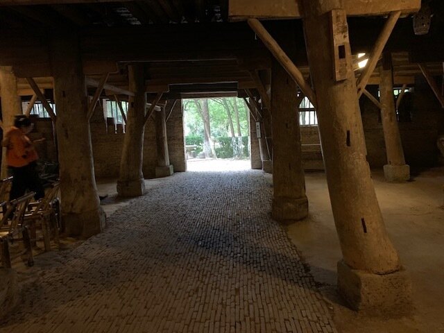
The Chateau was rebuilt at the beginning of the twentieth century after an older chateau was destroyed. It has significant acreage, a stables, a couple of gatehouses and outbuildings for chickens, goats etc. The Chateau itself is situated on a hill overlooking the village and a pond. At this time of the year it is very wet in this part of France and the streams and waterfalls, of which there are many, are filled to capacity. The sound of running water was always present in some form throughout our entire visit.

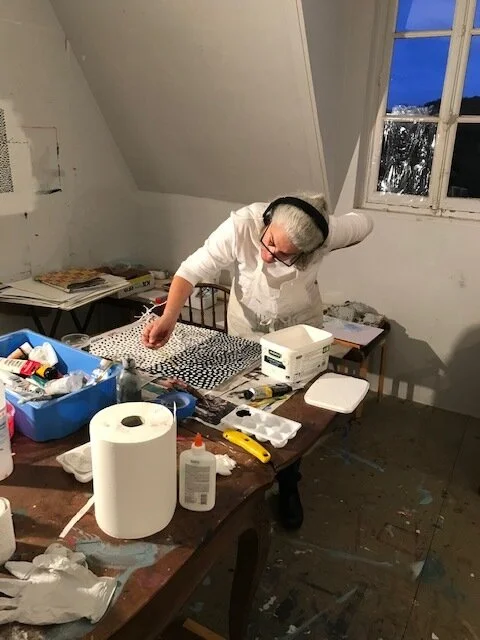
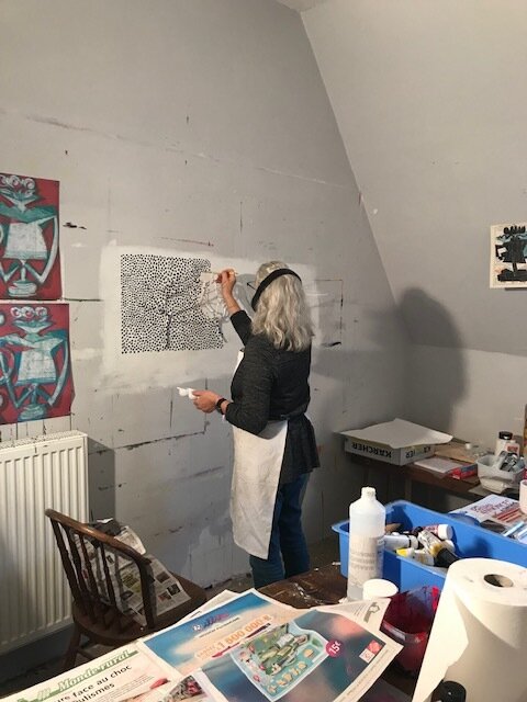
The residency at the Chateau is relatively new. Residents live and work in the chateau as well as in some beautiful buildings in town and the Gatehouse The Stables are used for storage and for studios. The director and owner of the Chateau, Ziggy Attias has very ambitious plans to make this residency a success and to restore the Chateau to its former glory at the same time. The atmosphere is busy, friendly, focused but also laid back. generous and open. A resident can work as much as one likes in h/her studio but the atmosphere of the chateau from its staff (wonderful cooks, cleaners and interns) to the activities, makes one feel that h/she is part of an adventure other than making art.

A month went by very quickly. We made side trips to Chaumont (the closest city where one could purchase essentials) and one major trip to Troyes, a city that has preserved a significant portion of its 15th century buildings, to include a number of churches and a major cathedral, intact. It wasn’t difficult to imagine what medieval life was like when one walks these ancient street and alleys.

The residency was productive, instructive and successful. We also had a small stay in Paris on our way in and out of France. We were very lucky to have no bad travel experiences to relate. Everything , aside from jet lag, was a success.

This is the Chateau. Our studios were located on the third floor, dead center of the building, right under the two large windows in the roof. The bottom floor houses the dining rooms, salon and kitchen as well as a few studios and bedrooms. The seco…

This is the Chateau. Our studios were located on the third floor, dead center of the building, right under the two large windows in the roof. The bottom floor houses the dining rooms, salon and kitchen as well as a few studios and bedrooms. The second floor contains a number of bedrooms. The interns live in a lovely suite of rooms in the attic.

The above three images are of the gatehouse, where we lived for the month. The building is charming and it was good to have the privacy and proximity it provided. The images are two views of the gatehouse. One image shows the stream that ran next to…

The above three images are of the gatehouse, where we lived for the month. The building is charming and it was good to have the privacy and proximity it provided. The images are two views of the gatehouse. One image shows the stream that ran next to the it.

The other image is the Stables, located next to the Gatehouse. This is where a number of studios are located. Francine worked in one of them for her last two weeks in residency.

If the images seem a little dark, it is my bad choice of images. The weather was a mix of warm to chilly, more rain than sun but the rain was sporadic and, for the most part, light. Bad weather did not prevent any plan or activity. We had a few snowflakes one day and one glorious morning everything was covered by significant frost, making the landscape look like a fairy tale illustration. We were lucky that this was the day we drove to visit Troyes. The frosty beginning changed into a radiant sunny day.

More to come

Last Entry for a While

We will be traveling to the Chateau Orquevaux today so we may not be able to post images on the blog for a month. Instagram may be the place where all of our studio activities are seen.

Here is one last image from China, me and my Red Robot on Roller Skates featured in the Exhibit in Yixing.

This is a picture of a very jet-lagged me in front of my piece at the teapot show in Yixing. I think that a dozen photographers took this picture of me and they may be found in some Chinese Newspaper somewhere. From what can be seen in the picture, …

This is a picture of a very jet-lagged me in front of my piece at the teapot show in Yixing. I think that a dozen photographers took this picture of me and they may be found in some Chinese Newspaper somewhere. From what can be seen in the picture, this is a multi-leveled state of the art exhibition hall and the bases etc. were beautifully designed and appropriate to displaying a wide array of teapots.

Return Home From China

It has been three days since we returned home from China. Our trip was incredibly successful. The two main cities we visited were Yixing and Jingdezhen, two of the most important ceramic cities in China. historically and culturally.

We were able to make this trip because we were the invited guests of the Sino Canadian Ceramic Association based in Vancouver. Two of its members, Joyce Yin and Wei Cheng led us to well-known and off-the-beaten track sites that are usually unknown or unavailable to tourists. We are very grateful for their tireless efforts.

Two other Chinese cities we visited were Hangzhou and Shanghai, the former a stop on the bullet train and the latter the city we flew into and left. Hangzhou was beautiful - filled with beautiful images of what everyone associates with ancient China - exotic dragon shaped boats floating on a peaceful lily pad and lotus-leafed lake that is surrounded by green hills that have many different styles of pagodas and temples projecting from their summits. The lake itself is covered with islands, causeways and secret places accented with memorable architecture and paintings. Walls of Hibiscus flowers were in bloom. Shanghai is a gigantic ciity. Our view of it was the train and airport terminal, connected by super wide and efficient highways. e saw incredily futuristic and gigantic architecture.

In Yixing we participated in the opening of a new ceramic museum and the dedication of a new park that had once been a clay mine. We visited many museums, homes of Yixing teapot makers, the old village of Yixing with its 1,000 year old dragon kiln and too many other sights that I could mention here. I also saw my Robot teapot included in the First World Teapot Art Competition.

We traveled to Jingdezhen on a bullet train and saw as many sights there as we did in Yixing related to ceramics. JDZ has a history of being associated with the emperors so its museums and history had a very different focus. We saw a magnificently large five-storied museum that showcased Imperial porcelain. The entire history of Chinese ceramics is contained in these walls to include the Peoples Republic of China. We also visited a ceramic trade show in a building that dwarfed the Javits center many times in size. We visited the imperial kilns, met artists and visited ceramic production companies. We also had many less formal moments such as visiting the homes of ceramic artists and the Taoxichuan Art Center.

Before we will get the opportunity to get re-acclimated to our own time zone we will be leaving for France in a few days. Otherwise there would be many more observations and comments about our China Trip.

Here are some images:

Some Cups

Here is a sampling of some new cups from Francine. Similar imagery on each of them. It is great to see how the images not only encircle each cup but also relate to each other in a large group. These three cups do not have the applied colorful glazes. They are made using her traditional sgrafitto and slip-painting technique.

Photo by John Polak

I am not certain of it was on purpose or not but it is interesting to see three totally different polka dotted objects on three different cups

Two New Vases

I made a visit to John Polak yesterday and had two new imaginary Vases photographed. There are some changes, some evolution in these pieces. One of those pictured here is a lot more symmetrical, front and back views looking almost the same and the other has a great amount of difference between its sides.

This may be the tallest Vase I’ve made. Maybe 30”. It is very geometric and fluid at the same time

This new vase is a little smaller than the other on this page. I used oil paint and waxed the surface. I like the results and may do it again on other pieces when it is appropriate. However it is interesting to see a highly shiny piece next to a matte surfaced one. Side by side, they enhance each other.

Both images were photographed by John Polak. Always a pleasure to see him do his magic on these difficult pieces.

"Colorful Birds and Laundry" Triptych

Francine continues to explore the birds and laundry theme in her work. This triptych , a complex exploration of patterns, textures and painted glaze, maintains a skillful balance of humor and social observations.

Each porcelain unit is 11” x 11” and the triptych, depending on its arrangement , is @ 34” in width.

China Visit

I had two pieces accepted into the 1st Session of World Teapot Art Exhibition. We were invited to this event as well as to visit the Imperial Kilns in Jingdezhen. It will be a ten day tour. Everything is planned to visit artists’ studios, galleries and museums, all pertaining to ceramics. It is difficult to know what to expect but we are eager to see China for the first time. A chance of a lifetime.

Almost as soon as we return, we will pack up our art supplies and bags to visit Chateau Orquevaux in France.

1st Session of World Ceramic Teapot Art Exhibition

Bisque Firing

We just fired a large bisque containing the three new pieces I recently made as well as a large amount of Fran’s work. One of my pieces didn’t fit into the kiln so it was fired in a smaller kiln. Everything came out fine - sometimes, even though the pieces are dry and one fires correctly and slowly, the unexpected crack or explosion takes place. But everything came out fine (hooray). Here is a picture of how odd the pieces looked in the kiln, bunched up against each other. Considering that these pieces are meant to be seen frontally, these pieces look very strange when seen from this side angle.

IMG_5488.JPG

And another one .....

The last piece posted had many alternative ending solutions. I think I have at least three possible variations that could be successfully used in completing this piece. It will be a lot of fun to play with the possibilities when all of the separate pieces come out of the kiln. Maybe I will not choose one as the only solution but instead will allow the piece to have many different potentials.

In the intervening time another piece was completed. This one again proved to be a real head-scratcher. I think there are more disparate elements in this piece. Trying to resolve all of the parts was more difficult but, in the end, the parts became one whole, connected and satisfying piece.

This piece is as large as the previous. It also has a very different look from one side or the other. I am trying to make the edges as sculpturally interesting as the front and back sides of the piece and, while they never will be able to be taken for a major view of the piece, they do help the piece to work more “in the round”.

Next Day's Progress

Here is a similarly formatted and documented set of shots showing the latest vase in progress. Yesterday’s posting was almost the same but today’s images show the difference that clean up and fine tuning can make. The top of the piece, the mouth, is new and different from yesterday’s but the same handles were incorporated in a different location. I am becoming more convinced that this piece should not have a flower i but I will make one to see. The original drawing shows a very delicate, wispy flower that would be impossible to make out of clay. I am reminded of Val Cushing’s making more than one lids for his covered jars because he always challenged himself to have more than one solution to finish his covered pieces. It may be interesting to have one of these pieces capable of having two different “looks”.

Work in Progress

I continue to work on the imaginary vase series. The latest images shows a front and back view of a work in progress. This particular vase tried to recreate the loopy handles that are so easy to draw but are very difficult to create in clay. Gravity and the nature of the material (its inclination to sag if over-extended or too wet) make these elements difficult. This is a first attempt and I hope that I would get better at anticipating problems and increasing my dexterity as I continue trying to solve this problem.

I’ve included a randomly chosen drawing of an assembly of vases to show how handles can be elaborate in a drawing. Trying to recreate them in a sculpture (out of clay) can be difficult.

I am including these images just to record a before and after situation, where the unrefined features of this vase can be looked at in comparison to the finished version.

I realized, as I got to the top that this piece, that perhaps I do not have to sculpt a “flower” to complete this form. So much sculptural information is happening that a flower may trivialize the sculptural focus of the vase. I also am toying with the idea of closing the top of the vase, not permitting a flower to be inserted. I don’t know if these are pivotal or major issues but many possibilities exist in the making of these pieces. Each decision made at an early stage directs one to different decisions later on.

I continue to rethink the title of this series. “Imaginary Vase” hardly seems appropriate when they do exist and no longer are imagined but real. Perhaps the time has come to call them what they are - sculptural vases. Another choice is to give an individual name for each piece. This one in particular reminds me of particular cultural pieces that have multiple handles like Jomon or African pieces and even some elaborate Baroque vases.

Assembly #8  ink, white pencil on paper 28” x 22”

Assembly #8 ink, white pencil on paper 28” x 22”

A New Vase

I have been working on the latest addition to the Imaginary Vase series.

Each Vase is another step forward but each vase also gives me more information than I can possibly use for another ten vases. This particular piece began with a firm plan, but when I was halfway through I couldn’t realize the drawing i had made for it and, after I cut it down to “begin again” a couple of times, I decided to go back to an older way of working - let the piece discover itself during the building process.

It was a lot of trial and error, to include the top element. This may be the fourth version of the flower element. Now that it is finished, I can state that I think it is strong and successful. It is “flat” but is a lot more three dimensional that any of its predecessors. The “side views” are complex and integrated into the whole viewing experience a lot more than any of the others in this series.

Now comes the harder part - how to finish it? it looks very hard edge and I am tempted to use cover coats or similar to re-state in color what exists in form but that probably would be garish and is a very dated and boring idea at best. Using a pencil on the surface of the piece was beneficial. Maybe this will be helpful in the glazing part of the finishing process.

I don’t know why but this very non-photo appropriate site was good enough for an accurate representation of what the piece looks like.

Hard at Work (Despite the Heat)

Francine has started to work on a number of large ambitious plates in the studio. The images included show the initial stages of carving the black slip off of the porcelain forms. The empty spaces in the interior of the large plate will be filled with her imagery, perhaps similar to the smaller rectilinear plate shown in the other image.

Another "Silhouette/Shadow" drawing

It has been a while since I posted anything - the many interruptions of summer. Studio activity has been been regular but broken up. I also had a very nice ceramic piece, another in the imaginary vase series but an odd accident happened that broke part of the piece so I have spent some time revisiting and repairing/replacing the broken part.

None of that relates to this drawing. It continues the theme of exploring silhouettes, backgrounds, positive/negative relationships while still using the vessel theme. This piece is a little bigger than the first in this series - 29” x 23”. It is made using marker, ink, white marker on Bristol paper. There is a complexity beginning here that could be explored even further so that the vessel concept will be left far behind in favor of design/abstract forms. We will see what develops. I suspect that the next focus for me will be in ceramics and I will try to make another in the series of Imaginary Vases.